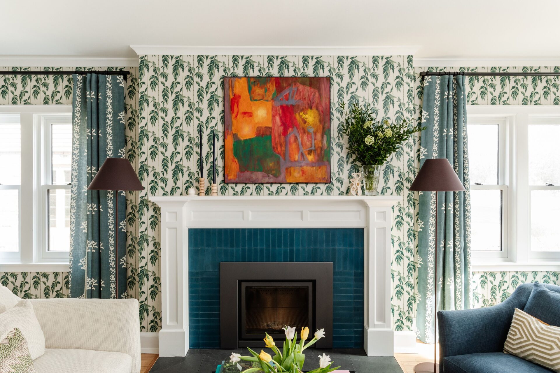
As interior styles have shifted toward maximalist patterns and layered textures, paint isn’t the only choice for enhancing your walls: as a favorite tool for designers and DIYers, whether it’s used to cover an entire room, ceiling, or an accent wall. has been well aware of wallpaper’s advantages for a decade now—and the family-owned brand is celebrating with its new Heritage Collection, made by its in-house creative team.
Over the past 10 years, Chasing Paper has worked with multiple collaborators, designing wall coverings, wall stickers, , and flooring. However, this selection in particular was made as a labor of love for the company: Co-founders and siblings Elizabeth and Michael Rees wanted these designs to reflect what they would want in their own homes.
The new collection features four timeless yet contemporary patterns in various color choices to go with the aesthetic of your space.
- Heritage Stripe updates a classic stripe with a delicate pattern reminiscent of stitching, adding charm to the design. Use it in light green for a bright touch of color, or try the dark plum in a bathroom for a moody moment.
- Kent Street has a whimsical feel, with its and trending small florals. The muted tones keep the pattern from being overwhelming. Pair it with cabinets in your kitchen.
- Legacy Leaves in burgundy, green, and light blue nod to the nature-inspired interiors that many homeowners crave. The three colorways can be used in a living room, primary, or guest bedroom for added warmth and .
- Samara brings a touch of a Moroccan aesthetic to a room, while the crisp deep blue, light blue, and green hues add a lighter feel. Use the dark blue on all the walls in your living room for a dramatic look or in an entryway in the lighter shades to make an immediate statement.
With the color and pattern options, this collection has a lot of room for playing—but it shouldn’t feel overwhelming. If you choose to mix them throughout your home, you don’t have to worry about making sure they flow together.
“One of the elements I love about this collection is that there are three main colorways to play with that are represented throughout each print: green, blue, and dark purple,” says Elizabeth. “For a maximalist effect, combine patterns in similar hues to create a cohesive design without it feeling overwhelming. When mixing prints, try combining a busy print with something a little more subtle, as the color story will carry through each part of the room while still allowing each pattern to have its own moment.”
According to Elizabeth, before choosing your print it’s important to decide if it’s going to be the main feature of your space or serve as an accent.
With the Heritage Collection in particular, think about how your decorated walls will fit in with the rest of your design: A bolder print, like Legacy Leaves, should be treated as the focal point, while a cleaner, more minimalist print like Heritage Stipe can be used as a backdrop.
“If wallpaper is the focal point, pull in other design elements that have similar colors in the print to balance the space cohesively, such as window treatments, throw pillows, or a table lamp,” Elizabeth says. “If you’re selecting a less graphic print, use wallpaper as the backdrop to the rest of the design. Bring in elements complimenting and matching the wall color, and don’t be afraid to add a bolder accent piece, such as a rug, that showcases some of the color or a play on the pattern.”

